ARO

Date
June 5, 2025
Fields of practice
Art Direction, Brand Strategy and Identity, Packaging
Context
ARO is a conceptual maceration cocktail bar based in Madrid that reinterprets classic mixology through a conscious, contemporary lens. The project explores how branding can support sustainable practices, transparency, and healthier patterns of alcohol consumption without compromising sensory richness or cultural depth.
The Challenge
The main challenge was to create a brand identity that stands out in Madrid’s growing cocktail scene while avoiding the clichés of traditional luxury or overt sustainability aesthetics. ARO needed to feel refined but accessible, contemporary yet timeless, and responsible without appearing prescriptive or moralizing.
Objective
To develop a clear and cohesive brand system that communicates transparency, craftsmanship, and conscious consumption. The identity needed to translate an intangible philosophy (zero waste, low-calorie, pre-batch cocktails with national seasonal ingredients) into a visual and verbal system that could scale across physical and digital touchpoints.
Research & Insights
Research focused on contemporary cocktail culture, sustainability practices in hospitality, and shifting consumer attitudes toward alcohol consumption. Insights revealed a growing demand for brands that communicate openly, reduce excess, and align with healthier lifestyles while maintaining a strong experiential and social component.
Design Strategy
The strategy positioned ARO as an honest and sensory-driven brand. Transparency informed the verbal identity through direct language and reduced rhetoric, while conscious consumption shaped the value proposition. Design decisions prioritized clarity, restraint, and material authenticity, allowing the product and process to take center stage.
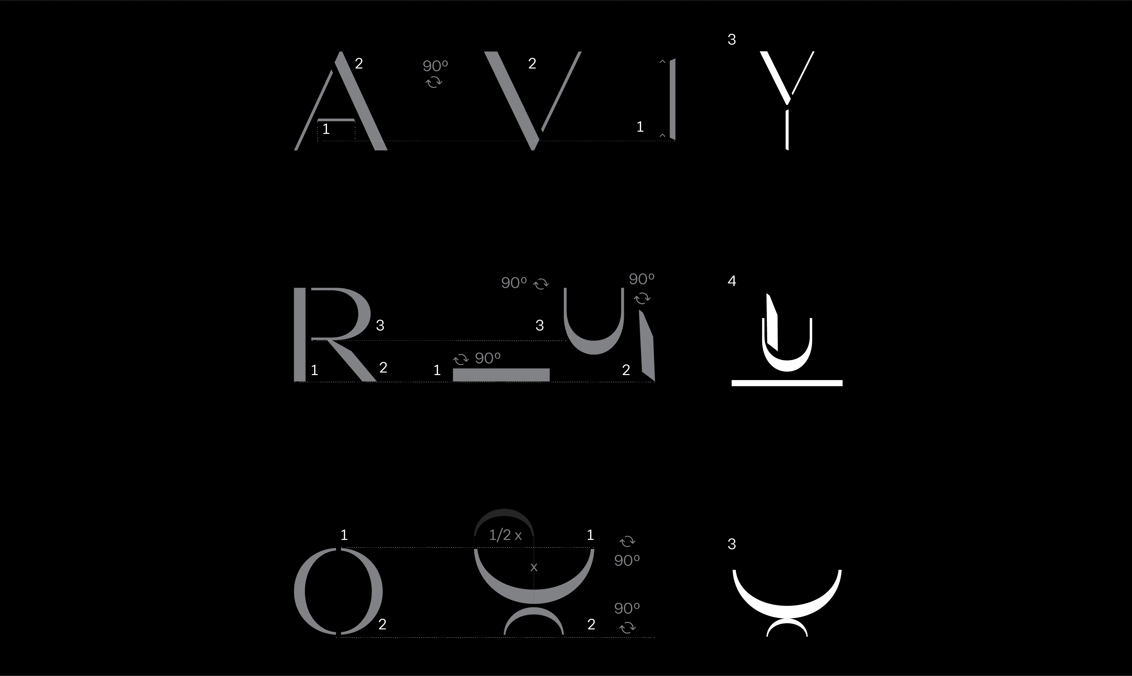
Visual System
The visual identity is built on a restrained palette, strong typographic hierarchy, and minimal compositional structures. Black and white serve as the foundation, with selective color used to highlight ingredients and seasonal variations. Texture and materiality reference maceration processes and handcrafted production, reinforcing the brand’s tactile and sensory nature.


Applications
The system was applied across labels, packaging formats, menus, and communication assets. Each application reinforces consistency while allowing flexibility for seasonal editions and product variations. The identity scales seamlessly from small-format labels to spatial and editorial uses.
Outcome
The resulting brand presents ARO as a contemporary alternative in the cocktail industry, balancing responsibility with pleasure. The identity establishes a precise positioning rooted in transparency, sustainability, and social awareness, offering a distinct and credible presence within a competitive market.
Reflection
This project reinforced the importance of translating research and values into tangible design systems. It strengthened an approach to branding that prioritizes clarity, intentionality, and long-term relevance over trend-driven aesthetics.


